The Challenge
Two chat products had coexisted on SAP Fiori Launchpad for years: a Digital Assistant for submitting requests, and Human-to-Human Chat for peer communication. They had been coupled and decoupled multiple times, and were currently placed under the same header — causing persistent user confusion.
Problem Statement
How should Digital Assistant and Human-to-Human Chat be positioned to coexist on Fiori Launchpad so that it's easy to understand?
The scope was specifically about placement and layout — not the functionality of either product.
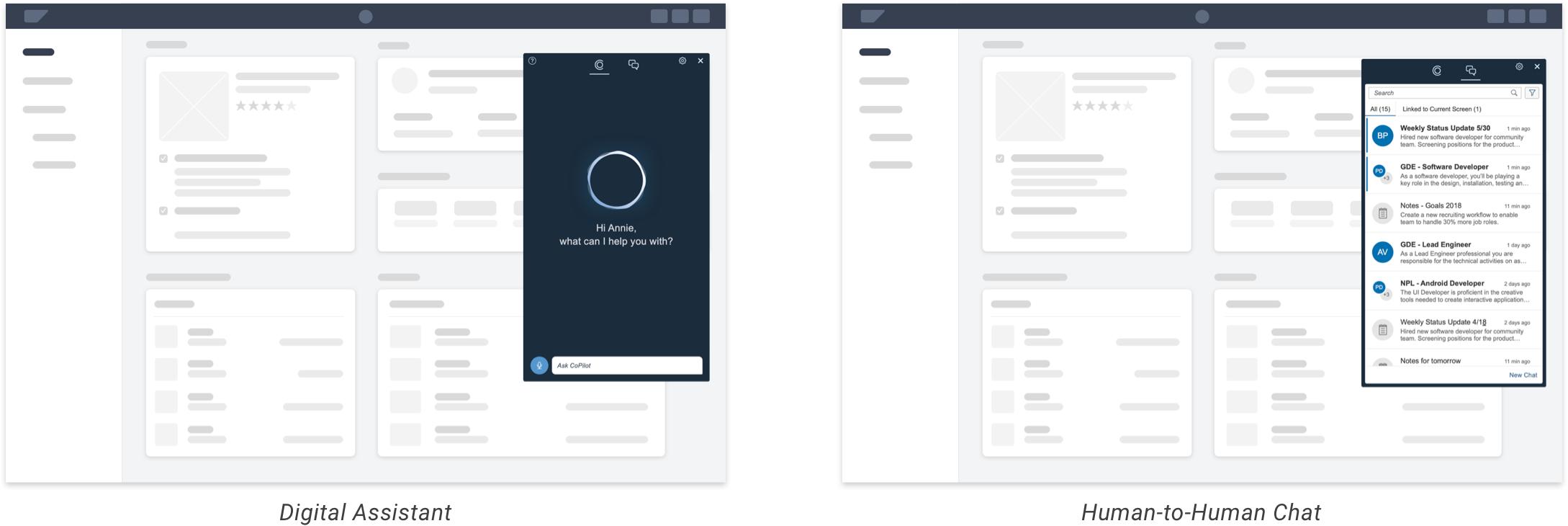
The existing design — DA and H2H under the same header
Design Highlights
Separate Entry Points
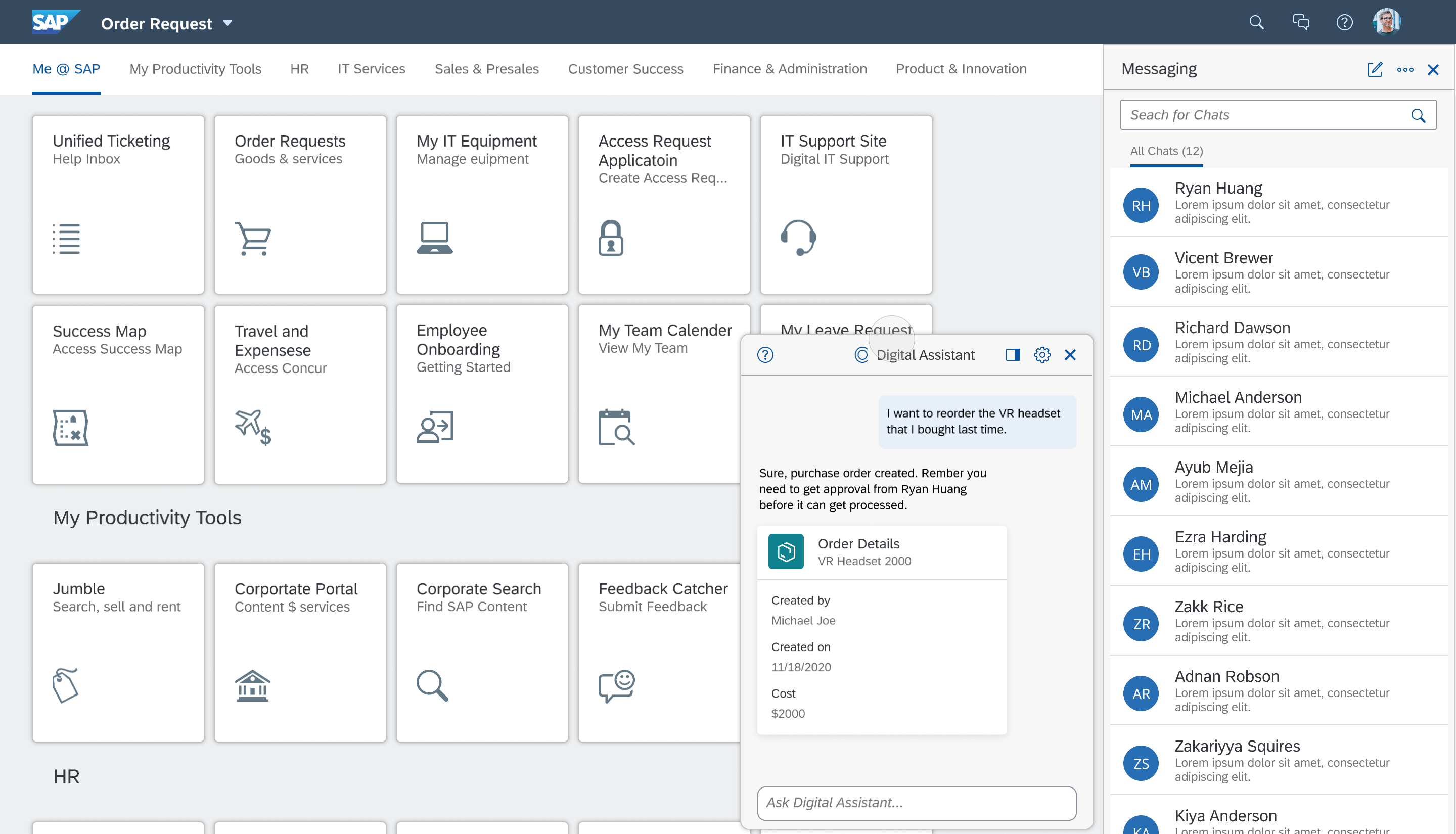
Users access the Digital Assistant from a floating button on the bottom right, and Human-to-Human Chat from the navigation bar. Separating the entry points immediately resolved the confusion between the two products.
Distinct Panel Behaviors
The Digital Assistant opens as a floating panel on the bottom right, while Human-to-Human Chat docks to the right side of the page. The different panel styles reinforce that these are distinct tools with different purposes.
Stacked Windows Option
For users who want to conserve screen space, we provide an option to stack the windows as a transient layout. This respects power users' workspace preferences without compromising the default clarity.
Research & Process
We applied the RITE method (Rapid Iterative Testing and Evaluation) over 2.5 months — generating ideas rapidly, testing with users biweekly, and evolving the design based on real feedback across 4 structured rounds.
20+ Explorations
Analyzed chat patterns across LinkedIn, Facebook, IBM, Salesforce, Adobe, and Slack — then generated over 20 design explorations covering entry points, panel layouts, and interaction models.
4 Testing Rounds
Structured biweekly sessions with 4+ participants each round. Each cycle generated both improvements to existing concepts and entirely new directions.
21 Participants
Across all rounds and the final validation survey, 21 users shaped the design — ensuring the solution was grounded in real feedback, not assumptions.
Design Validation
To convince the Fiori design council, we ran a survey with 16 participants comparing three options: the existing Fiori 3 pattern, a Fiori-guideline-compliant exploration, and our proposed design. Our proposal ranked highest in preference, earning support for implementation.
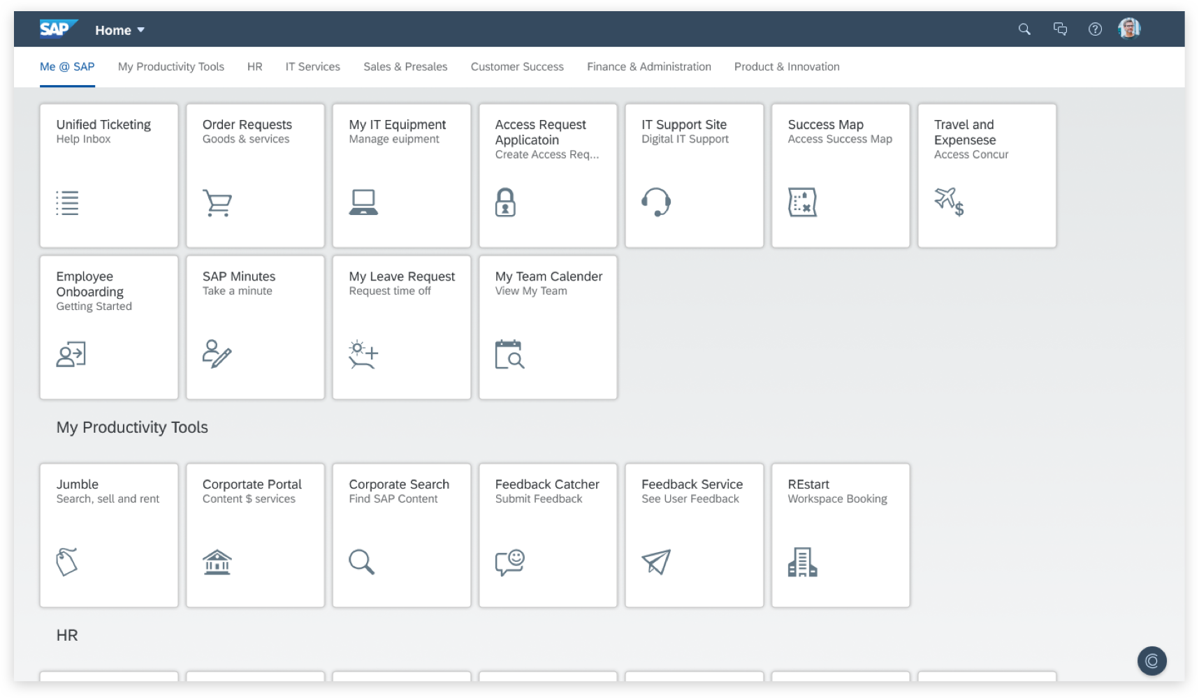
Icons in center header — users confused DA with H2H
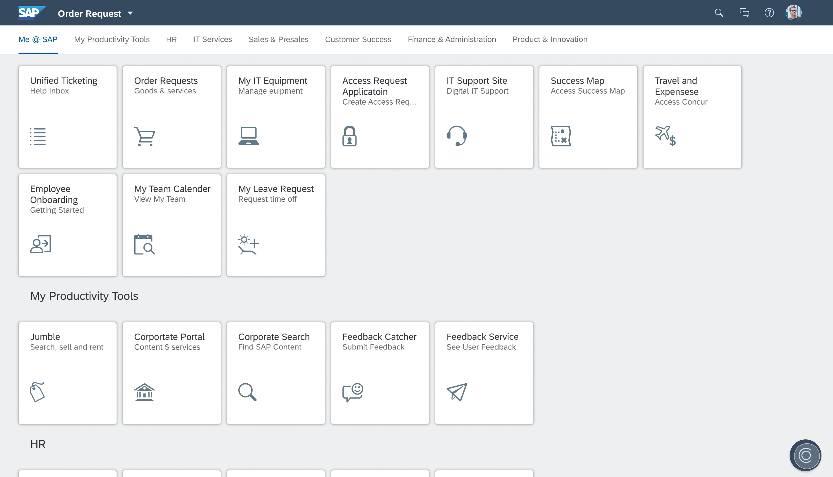
Icons close together — placement still ambiguous
Separate entry points — instantly clear and discoverable
Impact
Takeaways
Explore Broadly, Converge Deliberately
The RITE method forced us to resist premature convergence. Early rounds produced surprising insights that fundamentally changed our direction.
Data Persuades Stakeholders
Quantitative survey data combined with qualitative user quotes gave us the evidence needed to win design council approval for a significant platform change.
Separation Creates Clarity
When two products share an interface, users conflate them. Distinct entry points and panel behaviors made each product's purpose immediately obvious.